Learning Remix: styling with Tailwind
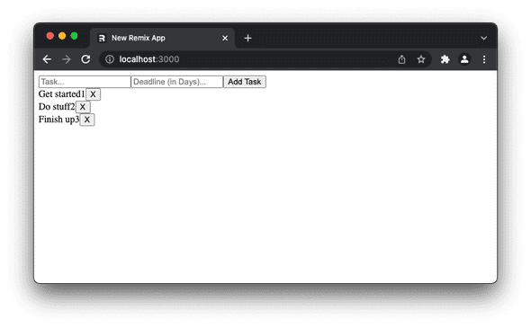
We’ve created a working Todo-app, and it looks awful. Nobody wants an app like that. I mean, look at it:

We need to make it look a lot nicer to get users to actually enjoy it.
We’re going to use Tailwind.css to style this, not because we have to, but because it’s all the rage right now. Is it better than all the other CSS tools? I don’t know, it might be, but probably not. We’ll use it anyway.
We start by installing it in our project:
npm install -D tailwindcss postcss autoprefixer concurrently

added 87 packages, and audited 552 packages in 18s

161 packages are looking for funding
  run `npm fund` for details

found 0 vulnerabilities
Next we need to initialise it, to generate tailwind.config.js and postcss.config.js:
npx tailwindcss init -p

Created Tailwind CSS config file: tailwind.config.js
Created PostCSS config file: postcss.config.js
Now we need to tell tailwind where our files are, and which suffixes to pay attention to. We do that in tailwind.config.js. We’re only interested in files inside the directory “app” in the same directory as the config file. And the only files we care about have the suffixes .ts and .tsx:
module.exports = {
  content: ["./app/**/*.{ts,tsx}"],
  theme: {
    extend: {},
  },
  plugins: [],
};
Now we need to update the scripts in our package.json. Tailwind needs to run postcss to do its magic, and that needs to happen before we run remix build. The altered scripts section in package.json should look like this:
"scripts": {
	"build": "npm run build:css cross-env NODE_ENV=production remix build",
	"build:css": "tailwindcss -m -i ./styles/app.css -o app/styles/app.css",
	"dev": "concurrently \"npm run dev:css\" \"cross-env NODE_ENV=development remix dev\"",
	"dev:css": "tailwindcss -w -i ./styles/app.css -o app/styles/app.css",
	"postinstall": "remix setup node",
	"start": "cross-env NODE_ENV=production remix-serve build"
},
We changed the build and dev parts, and added build:css and dev:css. The rest was there already.
As you can see in the build:css and dev:css sections, there are references to two files. Neither of which exist at the moment. We’ll create one of them, and tailwind will create the other for us when these scripts run.
The one we need to create is styles/app.css. The styles directory needs to be in the root of the project, NOT inside the app directory. This is what we need to add inside it:
@tailwind base;
@tailwind components;
@tailwind utilities;
Next, we need to import the file that tailwind will create. We do that in app/root.tsx, by adding this after the import of MetaFunction:
import styles from "./styles/app.css"

export function links() {
  return [{ rel: "stylesheet", href: styles }]
}
Do you use Visual Studio Code? Then you’ll want to install the Tailwind CSS Intellisense extension too.
That’s all the setup we need. Let’s start fiddling with our layout!
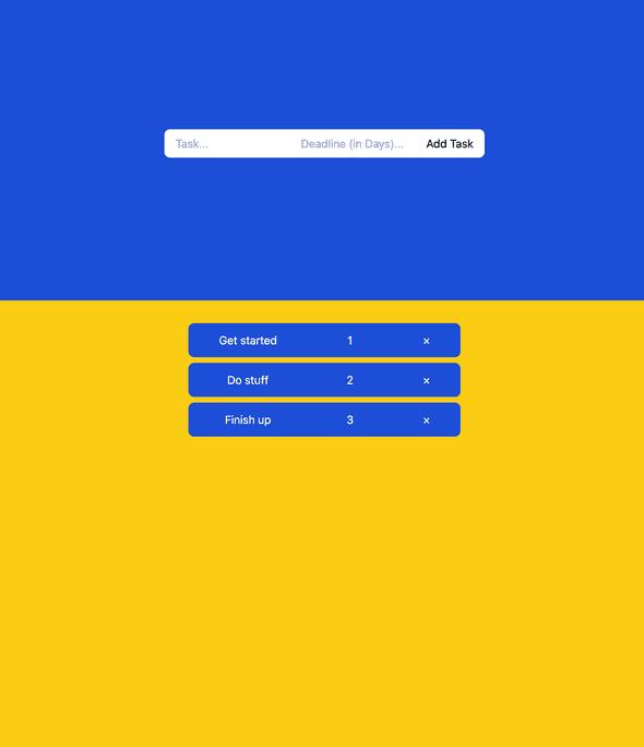
We need to know what we want first, and this is what I’m going to aim for:

Then we decide on what layout system to use. CSS Grid or Flexbox. In this case I’d say it’s a toss up. So I tossed a coin and settled on Flexbox.
Let’s divide the screen in two parts, roughly 1/3 for the top part, and 2/3 for the lower.
We’ll make the top part blue, and the bottom yellow, both should fill the width of the screen. The lower part needs a little padding on top.
The form should have rounded corners, a white background and a little padding.
Let’s also center everything in both sections.
This is what we need to add in index.tsx:
return (
<div className="flex flex-col h-screen">
		<div className="flex h-1/3 w-full">
			<div className="flex w-full h-full bg-blue-700 justify-center items-center">
				<Form className="flex rounded-lg bg-white h-10 px-4" ... >
				...
		</div>
		<div className="flex h-2/3 flex-col items-center bg-yellow-400 pt-8"> ...
		</div>
</div>
);
I’ve omitted all the things we already had, and replaced that with ....
One thing more in this file, to set the height on the inputs and the button, add className="h-10" to each of them.
That takes care of the changes we need in index.tsx. Next up is TodoTask.tsx.
I didn’t like to have a style attribute on the main div, so I decided to replace it with a className for consistency. To make it cleaner I created a new binding, displayMode. It replaces the ternary expression we used earlier:
let displayMode = isDeleting ? "hidden" :"flex";I also replaced block with flex as you can see. Using block would screw up the layout.
We add className={displayMode} to the wrapping div, to get our optimistic UI. If you want to use pending UI instead, you can replace "hidden" with "opacity-25".
Here are the rest of the className attributes filled in.
<div key={task.id} className={displayMode} >
	<fetcher.Form className="bg-blue-700 w-96 rounded-lg h-12 mb-2 p-3 text-white flex flex-col" ... >
		<div className="flex w-full">
	    <span className="flex w-2/5 justify-center">...</span>
      <span className="flex w-2/5 justify-center">...</span>
      <button className="flex w-1/5 justify-center" ...>...</button>
		</div>
      ...
	</fetcher.Form>
</div>
I quite like Tailwind. It narrows the options to a handful of reasonable values for every CSS property. That makes it easier to pick a value that works, and then you can always tweak it if you must.
The Intellisense plugin lets me hover over a className and see the resulting CSS values. The autocomplete feature is a nice bonus too.
That’s it for now. Stay tuned though, I’m considering another post that adds user authentication to this app…